Table of Contents

Introduction
CSS (Cascading Style Sheets) is a stylesheet language used to add style and layout to web pages. It provides a way to separate the content of a web page from its design, making it easier to maintain and update a website. It has become an essential part of web development and is used to create visually appealing and functional websites.
What is CSS?
CSS is a stylesheet language that is used to style and lay out web pages. It provides a way to add color, fonts, spacing, and other design elements to web pages, making them more visually appealing and easier to read. this is also provides a way to lay out web pages, determining the position of elements on the page and how they will be displayed on different devices.
Selectors and Properties
CSS uses selectors to target specific elements on a web page, and properties to define the style of those elements. CSS selectors can target elements based on their type, class, id, or attributes. CSS properties define the look and layout of the elements, such as their color, font, size, and position.
Selectors and properties are the building blocks of CSS. In this chapter, we’ll explore the different types of selectors and properties, and how they’re used to style HTML elements. You’ll learn about class and ID selectors, and how to use properties like color, font-size, and margin to control the look and feel of your website.
For example, the following CSS code targets all headings on a page and sets their color to blue:
h1, h2, h3, h4, h5, h6 {color: blue; }Layout and Responsive Design
Layout and responsive design are critical aspects of CSS. In this chapter, you’ll learn about the different layout options available in this, including floats, flexbox, and grid. You’ll also learn about responsive design and how to use media queries to create a responsive website that looks great on any device.
- Setting the Viewport for Responsive Design
The viewport is a crucial component of responsive design, and it’s used to control the size and scaling of a website on different devices. In this chapter, you’ll learn how to set the viewport using the viewport meta tag, and how to control the size and scaling of a website using the initial-scale, maximum-scale, and user-scalable properties.
Transitions and Animations
Transitions and animations add dynamic and interactive elements to your website. In this chapter, you’ll learn how to use transitions and animations to create stunning effects, and how to control the timing and behavior of these effects.
Debugging and Troubleshooting
Debugging and troubleshooting are an inevitable part of web development. In this chapter, you’ll learn about the different tools and techniques for debugging and troubleshooting, and how to use the developer tools in your web browser to diagnose and fix CSS issues.
Working with Colors and Fonts
Colors and fonts are an essential part of any website’s design. In this chapter, we’ll explore how to work with colors and fonts in CSS. You’ll learn about the different color models, including RGB and HEX, and how to use font families and web fonts.
Box Model

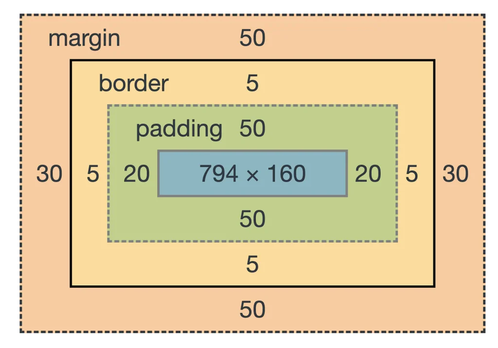
The CSS box model is a fundamental concept, it provides the structure for how elements are displayed on a web page. The box model defines the elements as rectangular boxes, with content, padding, borders, and margins. Understanding the box model is essential for creating accurate and effective layouts in CSS.
- Understanding the Basics of the CSS Box Model
In this chapter, we’ll explore what the CSS box model is and how it works. You’ll learn about the different components of the box model, including content, padding, border, and margin. You’ll also learn about the box-sizing property and how it affects the sizing of elements in the box model.
- Controlling the Size of Elements with Padding
Padding is one of the most important components of the CSS box model. In this chapter, you’ll learn how to control the size of elements using padding. You’ll explore the different padding properties, including padding-top, padding-right, padding-bottom, and padding-left, and how to use them to adjust the space between an element and its content.
- Adding Borders to Elements
Borders are an essential part of web design, and the box model makes it easy to add borders to elements. In this chapter, you’ll learn about the different border properties, including border-width, border-style, and border-color. You’ll also learn how to create rounded borders, and how to use border images to add unique designs to your borders.
- Controlling Space with Margins
Margins are an essential component of the box model, and they’re used to control the space between elements. In this chapter, you’ll learn about the different margin properties, including margin-top, margin-right, margin-bottom, and margin-left, and how to use them to adjust the space between elements. You’ll also learn about the box-shadow property and how it can be used to add shadows to elements.
- Using the Box Model for Layout
The CSS box model is a powerful tool for layout and positioning elements on a web page. In this chapter, you’ll learn how to use the box model to create complex and responsive layouts. You’ll explore different layout options, including floats, flexbox, and grid, and how they can be used with the box model to create beautiful and functional websites.
Layouts and Positioning
It provides a variety of layout and positioning options, including float, display, and position. These properties can be used to create complex and sophisticated layouts for websites. For example, the float property can be used to wrap text around an image, while the display property can be used to change the display of an element from a block to an inline element.
Responsive Design
Responsive design is a technique for creating websites that look good on all devices, from large desktop monitors to small smartphones. CSS provides the tools to create responsive designs, using media queries to adjust the layout and styles of a web page based on the size of the screen.
Benefits
- Separation of Content and Presentation: The biggest advantage of this is the separation of content and presentation. This means that the HTML document contains only the content, while the appearance of the page is controlled by the CSS stylesheet. This makes it easy to make changes to the appearance of the website without having to make changes to the HTML code.
- Improved Accessibility: CSS makes it easier to make websites accessible to users with disabilities. By using this, developers can ensure that the website is accessible to users who use screen readers, and that the site is optimized for users with visual impairments.
- Consistency: CSS allows for consistent styling across multiple web pages. By using a single stylesheet, it is possible to apply the same style to multiple pages, making it easier to maintain the website.
- Better Performance: It makes it possible to improve the performance of a website. By using this, it is possible to load the stylesheet once and reuse it on multiple pages, reducing the amount of data that needs to be loaded each time a page is accessed.
- Easy Maintenance: CSS makes it easier to maintain a website. By separating the presentation from the content, it is possible to make changes to the appearance of the website without having to make changes to the HTML code. This makes it easier to update the website and keep it looking fresh and modern.
Versions
- Cascading Style Sheets1: The first version of CSS was introduced in 1996 and was called CSS1. This version introduced the basic concepts of CSS, including the ability to style text, set margins and padding, and control the layout of a page.
- Cascading Style Sheets2: The second version of CSS, CSS2, was released in 1998 and added many new features, including the ability to control the position of elements on a page, use backgrounds and borders, and create complex layouts.
- Cascading Style Sheets3: The third version of CSS, CSS3, was released in 1999 and added even more features, including the ability to use animations, transitions, and media queries. CSS3 also introduced modules, which allowed for the addition of new features without having to wait for a new version of CSS to be released.
- Cascading Style Sheets4: Although CSS4 has not officially been released, it is in development and is expected to introduce new features such as variables, color functions, and grid and flexbox layout.
CSS3 has been a significant step forward for CSS, introducing many new features that have made it easier to create dynamic and interactive websites. One of the most important features of CSS3 is media queries, which allow developers to create styles that are specifically designed for different devices, such as desktop computers, tablets, and smartphones. This has made it possible to create responsive websites that look great on all devices.
Another important feature of CSS3 is animations, which allow developers to create animations that run in the browser, making it possible to create dynamic and interactive websites. Transitions are another important feature of CSS3, allowing developers to create smooth transitions between states, such as when a button is hovered over or clicked.
Conclusion
This is a crucial part of web development, providing a way to add style and layout to web pages. Whether you are a beginner or an experienced web developer, understanding CSS is essential for creating visually appealing and functional websites. With its wide range of options and its support for responsive design, it remains a powerful tool for web designers and developers.
