Table of Contents

Introduction
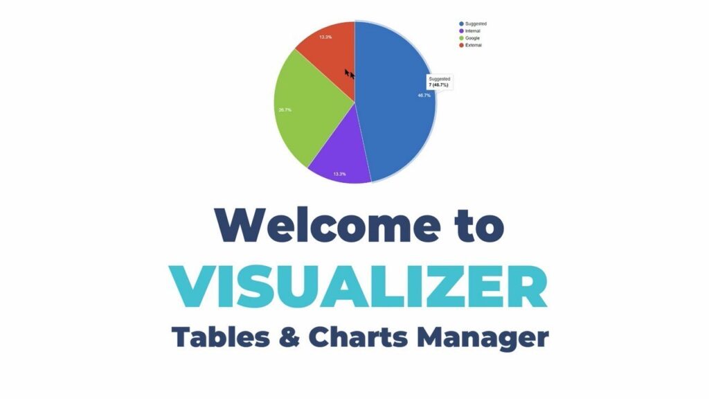
WordPress Visualizer, Data visualization has become an essential component of any website’s content strategy. Visualizing data helps website owners display complex information in a way that is easy to understand and digest. WordPress Visualizer is a powerful plugin that allows website owners to create stunning visual representations of their data. In this blog, we’ll explore WordPress Visualizer in detail, including its features, benefits, and how to use it to create charts and graphs that enhance your website’s performance.
Features of WordPress Visualizer:
WordPress Visualizer offers a wide range of features that make it an ideal data visualization tool for your website. Some of the features include:
- Wide variety of chart and graph types: WordPress Visualizer supports a broad range of chart and graph types, including line charts, pie charts, bar graphs, and more.
- Customizable styling options: The plugin allows you to customize the styling of your charts and graphs, including the colors, fonts, and backgrounds.
- Import and export data: With WordPress Visualizer, you can import and export data to and from Excel, CSV, Google Sheets, and other data sources.
- Real-time data updates: The plugin allows you to set up automatic data updates, ensuring your charts and graphs are always up to date.
- Responsive design: WordPress Visualizer is designed to be mobile-friendly, ensuring your charts and graphs look great on any device.
Benefits of Using WordPress Visualizer:
Using WordPress Visualizer offers several benefits, including:
- Improved user engagement: Charts and graphs help to engage users and keep them on your website for longer. By using WordPress Visualizer to display data, you can keep users engaged with your content.
- Improved data analysis: WordPress Visualizer allows you to display data in a way that is easy to analyze and understand, making it an ideal tool for data-driven websites.
- Improved website performance: With WordPress Visualizer, you can create dynamic and interactive charts and graphs that load quickly, improving your website’s performance.
- Better SEO: By displaying data visually, you can improve your website’s SEO by increasing the time users spend on your website and reducing bounce rates.
How to Use WordPress Visualizer:
Using WordPress Visualizer is easy. Here are the steps to create charts and graphs on your website:
- Install and activate WordPress Visualizer: You can download the plugin from the WordPress repository or install it directly from your website’s dashboard.
- Create a new chart: To create a new chart or graph, go to the WordPress Visualizer tab and click “Add New.”
- Choose your chart type: From the available chart types, select the one that best represents your data.
- Add your data: You can add data to your chart manually, or you can import it from a data source.
- Customize your chart: WordPress Visualizer offers a range of customization options, including colors, fonts, and backgrounds. Customize your chart to match your website’s design.
- Insert your chart: Once you’re happy with your chart, insert it into your page or post using the shortcode provided.
WordPress Visualizer History
WordPress Visualizer is a powerful data visualization plugin that allows users to create beautiful charts, graphs, and tables within WordPress. The plugin offers a wide range of customization options, making it easy to create visualizations that match the design of your website. WordPress Visualizer also allows you to import data from a variety of sources, including Excel and CSV files, making it easy to transform raw data into beautiful visualizations.
The Early Years: The Birth of WordPress Visualizer
WordPress Visualizer was first released in 2012 by the team at Themeisle, a popular WordPress theme and plugin company. The plugin was created in response to the growing demand for data visualization tools, particularly in the fields of business and research. The original version of the plugin offered a basic set of features, including the ability to create line charts, pie charts, and bar graphs.
Over the years, the plugin evolved, with new features and customization options being added in response to user feedback. One of the most significant changes was the addition of a range of new chart types, including bubble charts, scatter plots, and area charts. The plugin also became more user-friendly, with a simple drag-and-drop interface that made it easy to create and customize visualizations.
The Present: A Powerful and Feature-Rich Plugin
Today, WordPress Visualizer is one of the most popular data visualization plugins available for WordPress. It has a 4.9 out of 5-star rating on the WordPress plugin repository and has been downloaded over 200,000 times. The plugin has evolved to become a powerful and feature-rich tool for data visualization, offering a wide range of customization options, chart types, and data import options.
One of the most significant improvements to the plugin is the addition of advanced customization options. Users can now customize the colors, fonts, and styles of their charts and graphs to match the design of their website. WordPress Visualizer also offers a range of data import options, making it easy to import data from a variety of sources, including Google Sheets, JSON files, and APIs.
Another key feature of WordPress Visualizer is the ability to create interactive visualizations. Users can add tooltips and labels to their visualizations, allowing visitors to interact with the data and explore it in greater detail. This feature makes the plugin particularly useful for businesses and researchers who want to present their data in an engaging and interactive way.
The Future: What to Expect from WordPress Visualizer
As WordPress Visualizer continues to evolve, users can expect to see even more powerful features and customization options added to the plugin. One area of development is the integration of artificial intelligence and machine learning algorithms, which will allow users to create more advanced and sophisticated visualizations.
There is also likely to be an increased focus on data analysis, with more advanced tools for data manipulation and filtering being added to the plugin. This will make it even easier for
website owners to create stunning visualizations that are optimized for their specific needs.
Additionally, WordPress Visualizer is likely to expand its range of chart types, including more specialized charts for industries such as finance, healthcare, and education. This will allow businesses to create more detailed and specific visualizations that are tailored to their niche.
Overall, WordPress Visualizer has proven to be a reliable and effective tool for creating visually appealing data displays on websites. With its numerous features, easy-to-use interface, and ongoing development, it is likely to remain a top choice for website owners looking to enhance their data visualization capabilities. By using WordPress Visualizer, businesses can increase user engagement, improve website performance, and gain valuable insights from their data. So why not give it a try and see how it can benefit your website today?
WordPress Visualizer Versions
WordPress Visualizer is a powerful and versatile data visualization tool that has been helping website owners create engaging and interactive data displays for their users for many years. Over time, the plugin has undergone numerous updates and improvements, resulting in a range of versions that offer different features and capabilities.
In this blog, we will explore the various versions of WordPress Visualizer and highlight some of the key features that each version offers.
Version 1.0 – The Beginning
The first version of WordPress Visualizer was released in 2014, and it offered basic data visualization capabilities, including the ability to create pie charts, bar charts, and line charts. The plugin also provided basic customization options for changing the colors, fonts, and labels of the charts.
While this initial version was relatively simple, it provided a solid foundation for the plugin’s future development and paved the way for more advanced features in later versions.
Version 2.0 – Enhancements and Improvements
In 2015, version 2.0 of WordPress Visualizer was released, introducing a range of enhancements and improvements. This version included additional chart types, such as scatter charts, area charts, and bubble charts, and introduced new customization options for creating more visually appealing displays.
Version 2.0 also included support for additional data sources, such as Google Sheets, and introduced new import and export options for working with data more efficiently.
Version 3.0 – Interactive and Responsive
In 2016, WordPress Visualizer version 3.0 was released, which introduced a range of new interactive and responsive features. This version offered real-time updates and dynamic data loading, enabling users to interact with data and see changes in real-time.
Version 3.0 also introduced responsive chart design, allowing website owners to create data displays that adjust to different screen sizes and devices, providing a seamless user experience for all users.
Version 4.0 – Big Data and Mapping
In 2017, WordPress Visualizer version 4.0 was released, which introduced several new features to help website owners work with big data and create maps. This version included advanced data filtering options, allowing users to filter and manipulate large datasets with ease.
Version 4.0 also introduced support for geospatial data and mapping, enabling website owners to create visually appealing maps that display location-based data.
Version 5.0 – AI and Predictive Analytics
In 2019, WordPress Visualizer version 5.0 was released, which introduced several new features related to AI and predictive analytics. This version included advanced machine learning algorithms that could analyze data and provide predictive insights, allowing website owners to make more informed decisions based on data.
Version 5.0 also introduced new collaboration and sharing features, enabling multiple users to work on data visualizations and share them with other team members.
Version 6.0 – The Future
While the latest version of WordPress Visualizer is version 5.6, the development team is constantly working on new updates and enhancements to improve the plugin’s capabilities. In the future, we can expect to see even more advanced features and capabilities, including enhanced support for machine learning and AI, improved collaboration and sharing options, and new chart types for more specialized industries.
Conclusion
In conclusion, WordPress Visualizer is a powerful and versatile data visualization tool that can help website owners create engaging and interactive data displays for their users. By offering a range of chart types, customization options, and data import/export capabilities, Visualizer provides a comprehensive solution for businesses looking to enhance their data analysis and presentation capabilities.
One of the biggest benefits of using Visualizer is its ease of use. The plugin’s intuitive interface and drag-and-drop functionality make it easy for even non-technical users to create complex data displays in a matter of minutes. This means that businesses can save time and resources that would otherwise be spent on custom development or hiring outside experts.
Another key advantage of Visualizer is its compatibility with a range of data sources. The plugin can import data from various sources such as CSV files, Google Sheets, and MySQL databases, making it a flexible solution for businesses with different data management systems.
Moreover, Visualizer is continuously improving and updating, with new features and enhancements being added regularly. This means that website owners can stay up-to-date with the latest data visualization trends and techniques, and ensure that their website is always providing the best user experience.
Finally, using Visualizer can help businesses gain valuable insights from their data. By presenting data in an engaging and interactive way, businesses can encourage users to explore and interact with the data, leading to a better understanding of trends and patterns. This can help businesses make more informed decisions and improve their overall performance.
In summary, WordPress Visualizer is a powerful and flexible data visualization tool that can help businesses enhance their website’s data analysis and presentation capabilities. With its intuitive interface, compatibility with various data sources, and ongoing development, Visualizer is a reliable choice for businesses of all sizes looking to improve their data visualization and analysis capabilities.